U.S. Police-Caused Fatalities
By Justin S.
- 12 minutes read - 2355 wordsGeorge Floyd. Eric Garner. Tamir Rice.
Those names, among thousands of others, are emblematic of fatal police violence in the United States. The protest movement that has spread like wildfire across the U.S. has brought police brutality to the forefront of everyone’s minds.
Following the deluge of information from news stations and social media, I can’t help but wonder, what does the data say? Are these new trends or longstanding realities? How disproportionate is police brutality against black Americans? What role does mental health play? To ignite change, we need a strong empirical grasp of the issue at hand. Looking at the data makes that possible.
In this post, I will analyze twenty years of U.S. police-caused killings data. I will use a variety of exploratory and modeling techniques to answer the following questions: - How many people have been killed by police over time? - What is the race/age/gender of these people? - What are the demographics of the general population in which the incident occurred? - How does mental health status affect the likelihood of a police-caused killing?
Police-caused Fatalities Data
In this analysis, I’ll be working with a few datasets. Different datasets include 2000-2020 killings of individuals by police. On top of that, I have some census, incident, and subject-level data. The data runs from 2000-2020, which makes it an extremely expansive dataset of police-caused fatalities/killings over the past 20 years.
| id | name | age | gender | race | date | city | stateCode | manner_of_death | armed | mental_illness | flee | threat_level | body_camera | state | popEst2014 | percent_completed_hs | poverty_rate | race_percent |
|---|---|---|---|---|---|---|---|---|---|---|---|---|---|---|---|---|---|---|
| 1 | John Edward Pittman | 45 | Male | Black | 2000-01-05 | Dothan | AL | Shot | NA | FALSE | Flee | NA | NA | Alabama | 4849377 | 86.2 | 19.1 | 0.26 |
| 2 | Adrian Dolby | 31 | Male | Unknown | 2000-01-06 | Muscoy | CA | Shot | NA | FALSE | Flee | NA | NA | California | 38802500 | 44.9 | 33.5 | NA |
| 3 | Darryl Woodall Jr. | 23 | Male | Unknown | 2000-01-06 | Charlotte | NC | Shot | NA | FALSE | Flee | NA | NA | North Carolina | 9943964 | 88.4 | 16.8 | NA |
| 4 | Sonny Daniel Diaz | 24 | Male | Unknown | 2000-01-09 | Moreno Valley | CA | Shot | gun | FALSE | Flee | NA | NA | California | 38802500 | 75.2 | 19.3 | NA |
| 5 | Erin Forbes | 26 | Male | Black | 2000-01-10 | Bala Cywyd | PA | Shot | NA | FALSE | Flee | NA | NA | Pennsylvania | 12787209 | NA | NA | 0.10 |
| 6 | Guido Paul Jean | 17 | Male | Unknown | 2000-01-11 | Tampa | FL | Shot | NA | FALSE | Flee | NA | NA | Florida | 19893297 | 86.6 | 21.8 | NA |
After joining and binding together five disparate datasets, we get the dataset, seen above, that will drive most of this article’s analysis. We can see that we’re working with 15348 rows of data that shows the individual who died at the hands of police, some demographic information about them and about the city/state where they’re from, as well as information about the killing. It’s worth pointing out that demographic data is pulled from the 2014 Census Bureau data, which should serve solely as an estimation of the actual demographics of a city/state, mainly because some of the killings in this dataset occurred as early as 2000.
Now that we know what data we are working with, let’s start exploring it further.
What is the trend in police-caused fatalities over the past 20 years? As we can see below, the number of fatalities caused by police has grown significantly over the past 20 years, with a peak in 2015.
Police-caused Fatalities over Time
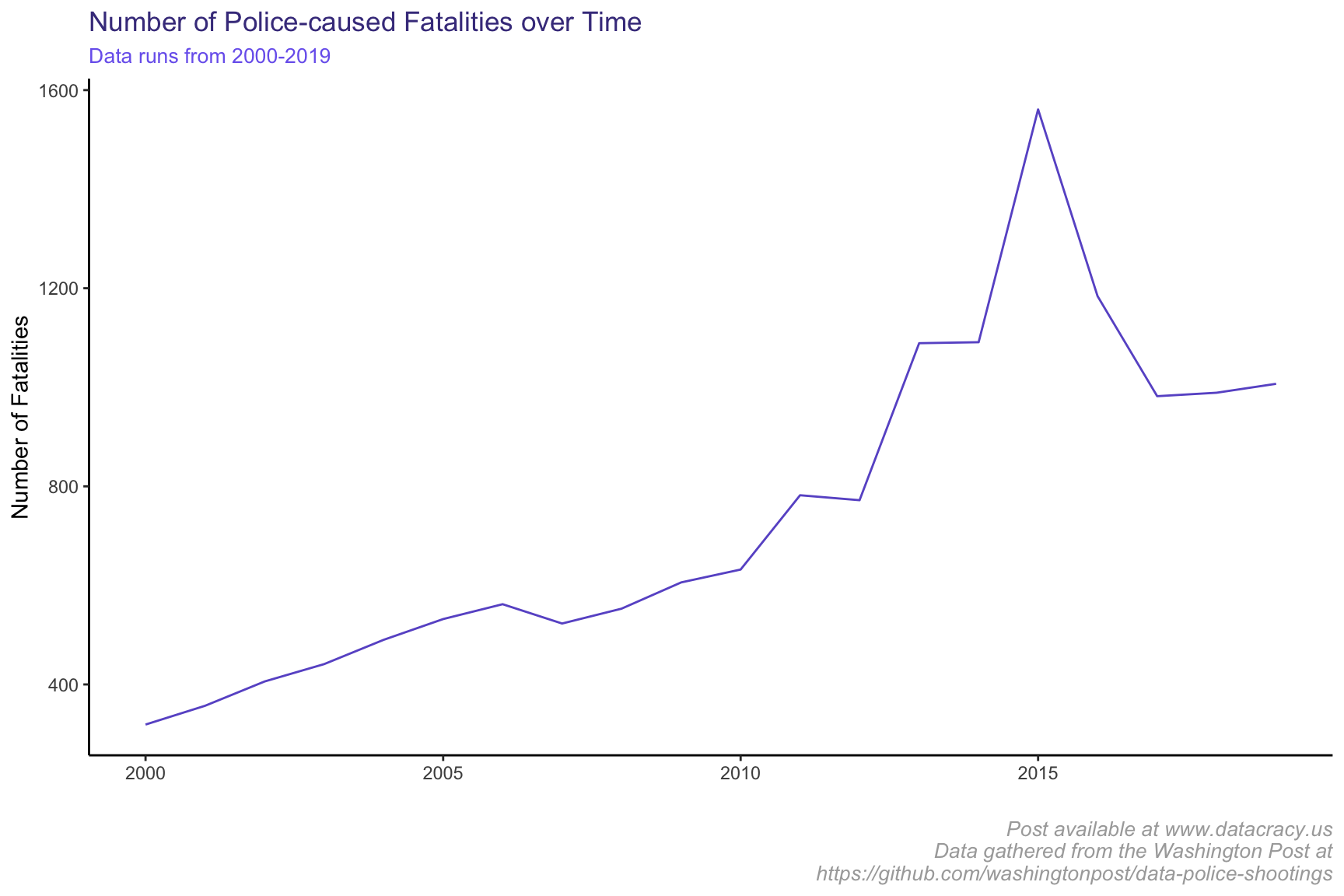
This is alarming and despite seeing a general decrease from peak in 2015 on, shows a change in approach by police in the way that they handle these situations. This is alarming and despite seeing a general decrease from 2015 on, shows a change in approach by police in the way that they handle these situations. The low number in 2020 is likely due to incomplete data from the year as well as less police-caused killings due to COVID-19. What may be causing this rise and subsequent fall? I’m no expert and would love to hear your thoughts. Here are my guesses:
- 2014-15 showed some of the worst cases of police brutality (Tamir Rice, Ferguson unrest, etc.). It seems plausible that people who were protesting police brutality may have been killed while protesting. With more attention, police officers may have been more careful after 2015.
- After these incidences, more substantive policies may have been put in place (police use of force policies, bystander intervention policies, de-escaltion training, etc.). Obviously this is not enough, but may have attributed to some decrease since 2015.
- Data collection! It looks like the Washington Post’s collection methodology changed in 2015, which may have an effect on the trends we’re seeing. More info on this is included at the bottom of my original post.
Police-caused Fatalities by Race
| race | fatalities | population_percent | fatalities_percent |
|---|---|---|---|
| Asian | 228 | 6% | 1% |
| Black | 3162 | 12% | 21% |
| Hispanic | 2261 | 18% | 15% |
| Native | 120 | NA% | 1% |
| Native American | 55 | 1% | 0% |
| Other | 140 | 3% | 1% |
| Unknown | 4282 | NA% | 28% |
| White | 5100 | 60% | 33% |
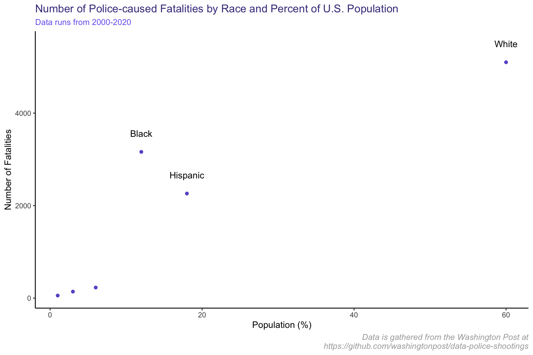
Interestingly enough, more White Americans have been killed by police than Black Americans, according to the dataset. This seems surprising to me, especially with everything going on in the news lately. To help explain this, I have added in the proportion of each race within the USA. From this, we can clearly see that Black Americans make up the second most targeted group by police, but only comprise 12% of the U.S. population. On the other hand, White Americans make up a bit more killings by police but comprise 60% of the U.S. population.
Another way of looking at this is that, in the U.S., non-Hispanic Black Americans make up every 1 in 8 people. White Americans make up every 5 in 8 people. Of Americans killed by police, every 2.3 in 8 people are black and every 3.7 in 8 people are white. By just looking at the table presented, Black Americans are the only race whose percentage of fatalities caused by police represents a significant increase from their share of the population. On top of that, if you combine Black and Hispanic Americans, they comprise half the population of White Americans; however, they constitute more fatalities by police.
Let’s show this in a fairer sense, by normalizing by each race’s proportion in the population.
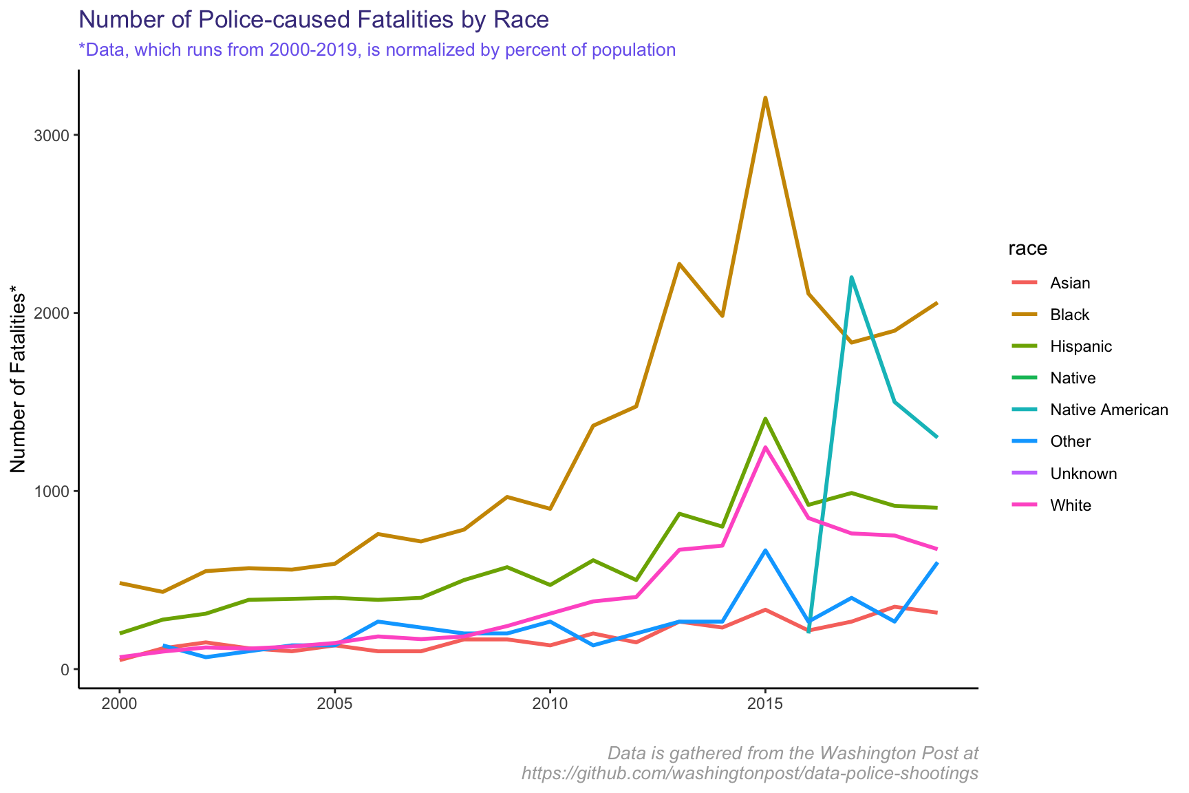
Now we can clearly see that in almost every year in our dataset, Black Americans were killed at a higher rate for their population than any other race. One thing I’ve noticed here is the spike in killings of Black and White people in 2015. That spike drops precipitously by 2016, but the spike is not nearly as significant as it is for other races.
Police-caused Fatalities by Age
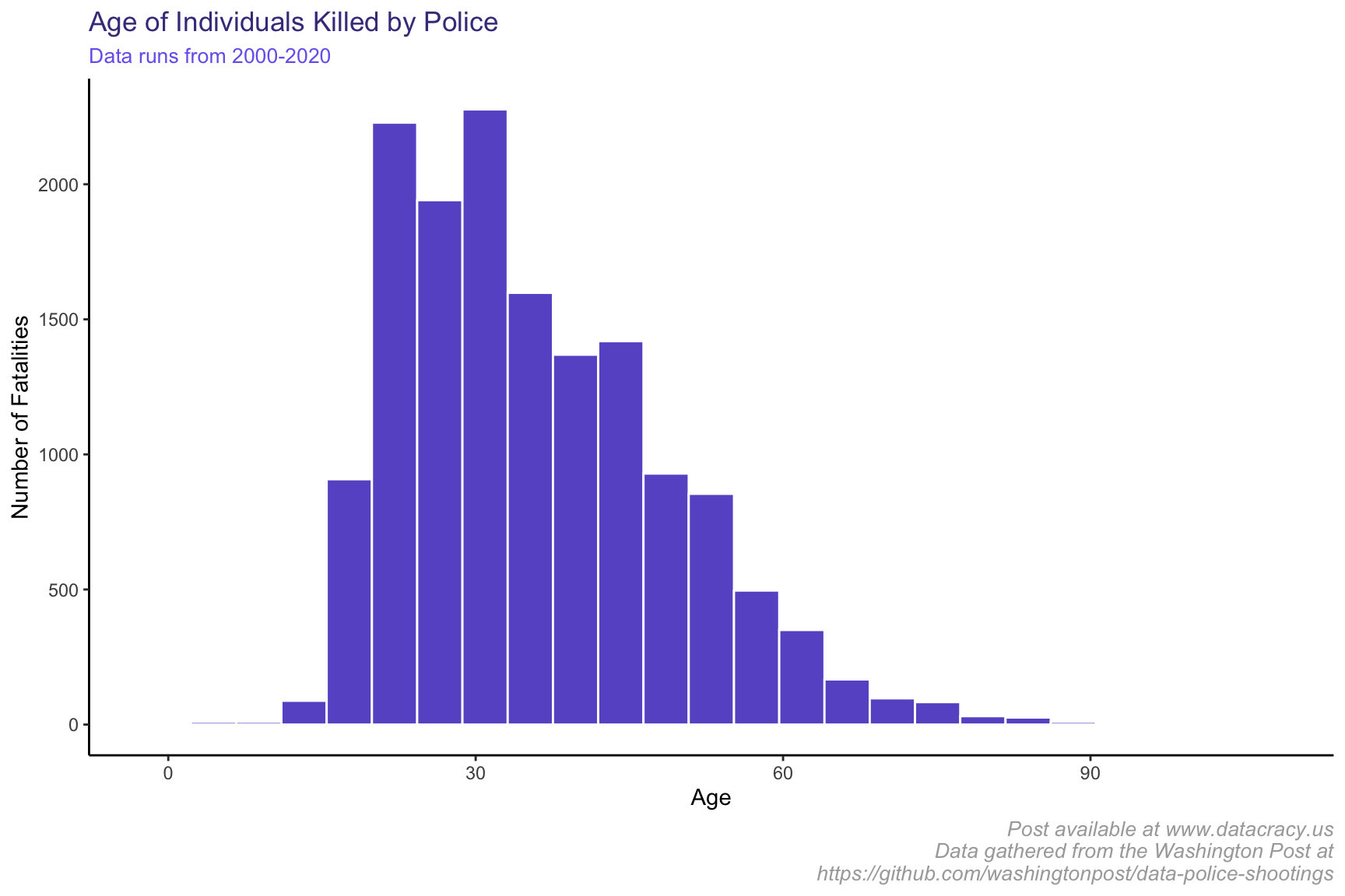
It looks like a pretty normal distribution by age, with possibly a right skew in the data. Most people who are killed are on the younger side, with the median age in our dataset being 33.
Police-caused Fatalities by State
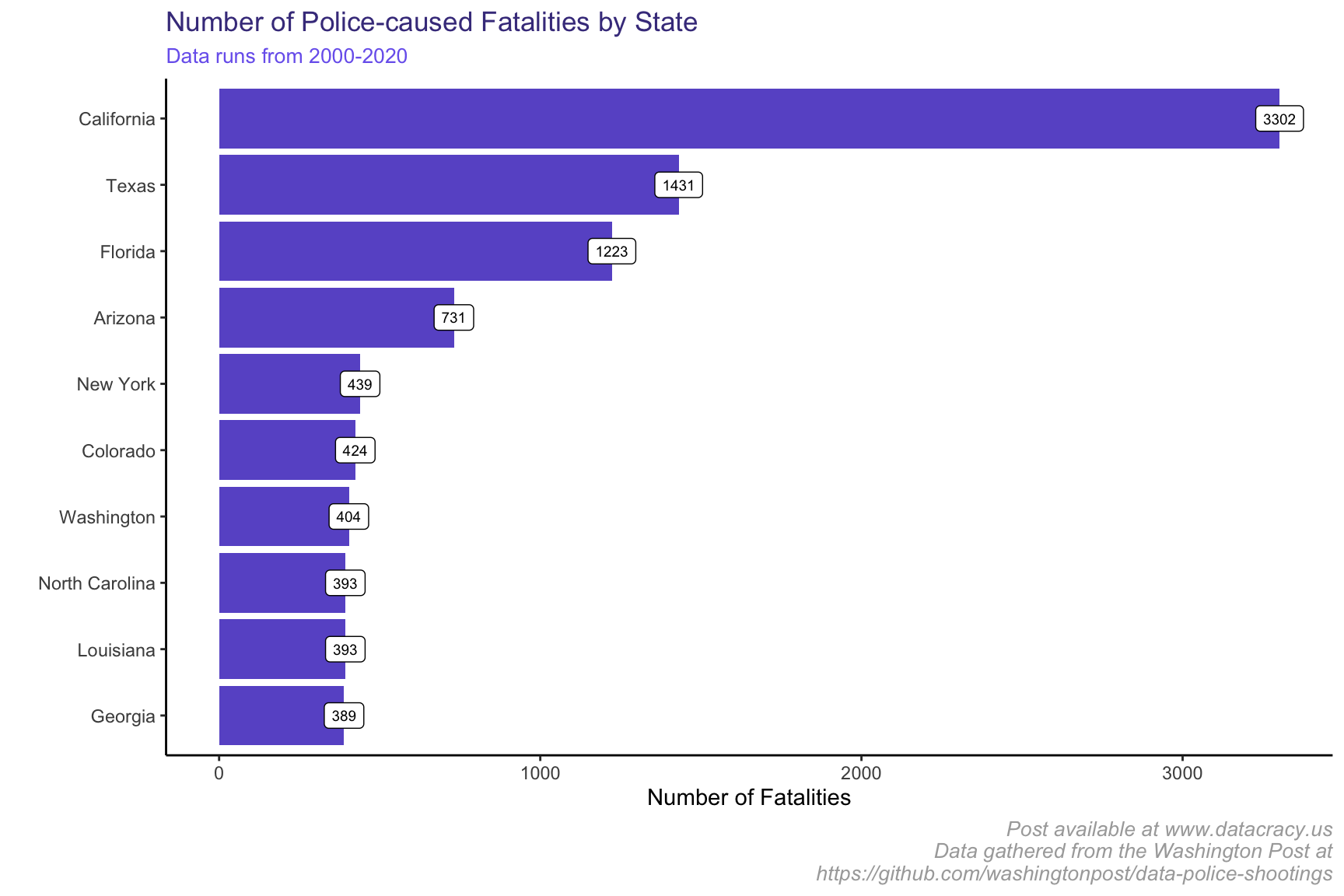
This isn’t helpful since the populations are so different. For example, some of our biggest states by population, like California and Texas, are showing up here. I have a hunch that if we normalize by the state population using some of our census data from 2014, we’ll get a better sense of fatalities.
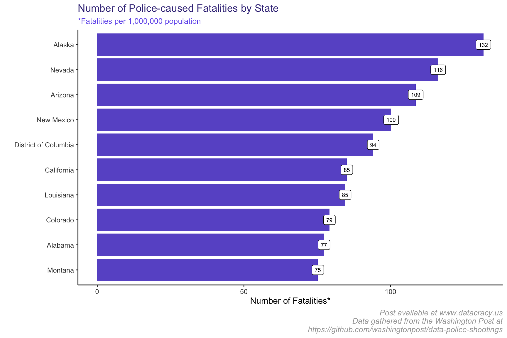
Super interesting! We now have a lot of new states in the visualization, showing that just because a state, like Texas, has a lot of police-caused fatalities, it doesn’t mean that it’s as high as other states proportionately to state population. It is worth exploring in a future iteration what these states have in common.
High School Completion Rate Analysis
I’d like to analyze the number of shootings against the average city population which completed high school. My hypothesis here is that there will be more shootings in cities with low high school completion rates.
The first thing to do is to fill out our data a bit more. There is a lot of geographic data that wasn’t brought in earlier. To fill out this data, I plan to impute it by finding the average rate for each state and using that. Afterwards, let’s look at a boxplot of the high school completion rate to get a better sense of the data distribution.
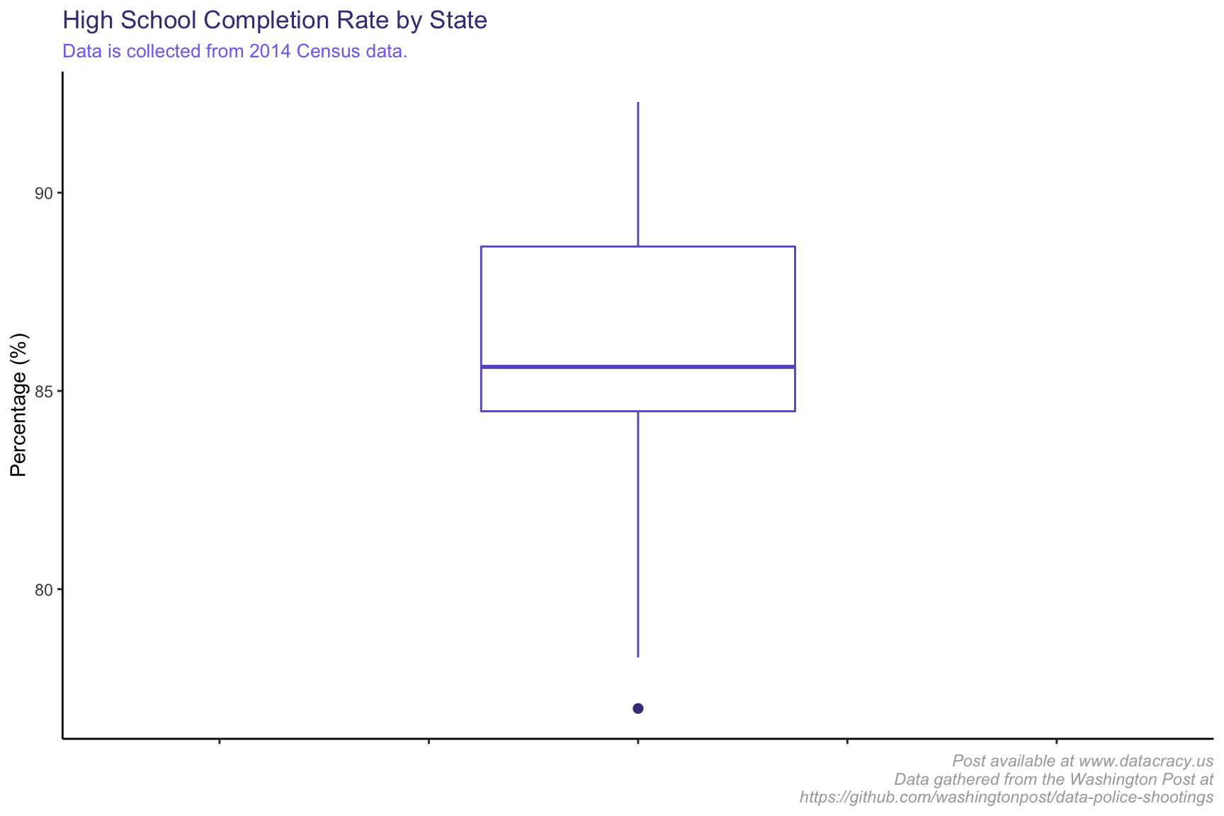
The boxplot shows the data distribution; that is, within the box above, we can see the middle 50% of data (25th percentile to 75th percentile lay). It looks like most of the areas have pretty high high school completion rates, with a median of 85.6068493 and an average of 86.2.
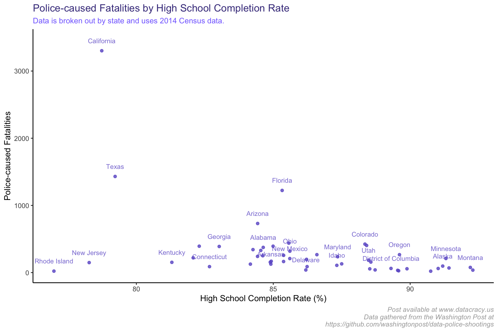
Again, this doesn’t account for normalizing our data by population. Let’s see how that changes things.
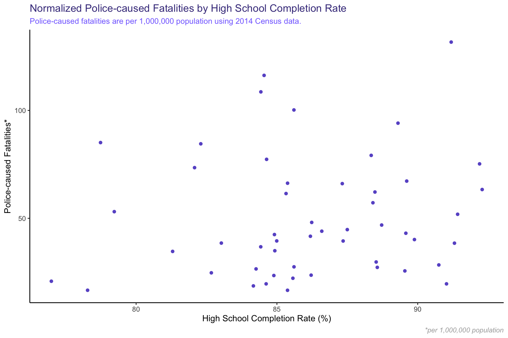
Between both of these graphs, I can’t see any correlation in the data. It’s reassuring to know that my original hypothesis, that police-caused fatalities would drastically increase in areas with lower high school completion rates, was wrong. To add some more statistical rigor to our analysis, let’s quickly look at the correlation between high school completion rate and number of police-caused fatalities.
Joining, by = “state”
| fatalities | hs_completionavg | popEst2014 | |
|---|---|---|---|
| fatalities | 1 | -0.4351 | 0.8811 |
| hs_completionavg | -0.4351 | 1 | -0.5119 |
| popEst2014 | 0.8811 | -0.5119 | 1 |
| fatalities_normalized | 0.2587 | 0.1233 | -0.06594 |
| fatalities_normalized | |
|---|---|
| fatalities | 0.2587 |
| hs_completionavg | 0.1233 |
| popEst2014 | -0.06594 |
| fatalities_normalized | 1 |
What does this mean? Well, when two variables are highly correlated we would expect the value in the above table to be close to +/-1. On the other hand, when two variables have no demonstrable relationship (no correlation) we would see a value very close to 0. From this we can see that the correlation is highest between population and fatalities (.88), which makes sense - we saw earlier that a larger population corresponds to more deaths. But the correlation we care about here, between high school completion rate and fatalities normalized for population, is only .1233, which is rather low. Overall, I would say that there is little correlation between fatalities and high school completion rate.
Poverty Rate Analysis
I’d like to analyze the number of shootings against the average city poverty rate. My hypothesis here is that there will be more shootings in cities with high poverty rates, although my hypothesis earlier was debunked, so we will see!
First, let’s see if there’s correlation between poverty rate and number of police-caused killings.
Joining, by = “state”
| fatalities | avg_poverty | fatalities_normalized | |
|---|---|---|---|
| fatalities | 1 | 0.0751 | 0.297 |
| avg_poverty | 0.0751 | 1 | -0.1846 |
| fatalities_normalized | 0.297 | -0.1846 | 1 |
There’s a bit of correlation here (-.1845) which is slightly larger than what we saw with high school completion rate. The interesting thing to note is the negative in the correlation. This means that as poverty rates generally increase, the number of police-caused fatalities per 1,000,000 population goes down, which is exactly opposite of what I originally thought. Again, the negative correlation is rather weak, so I would not read too much into it.
Let’s take a quick look at a scatterplot to see this negative relationship. I’ll super-impose a regression line to help show the relationship.
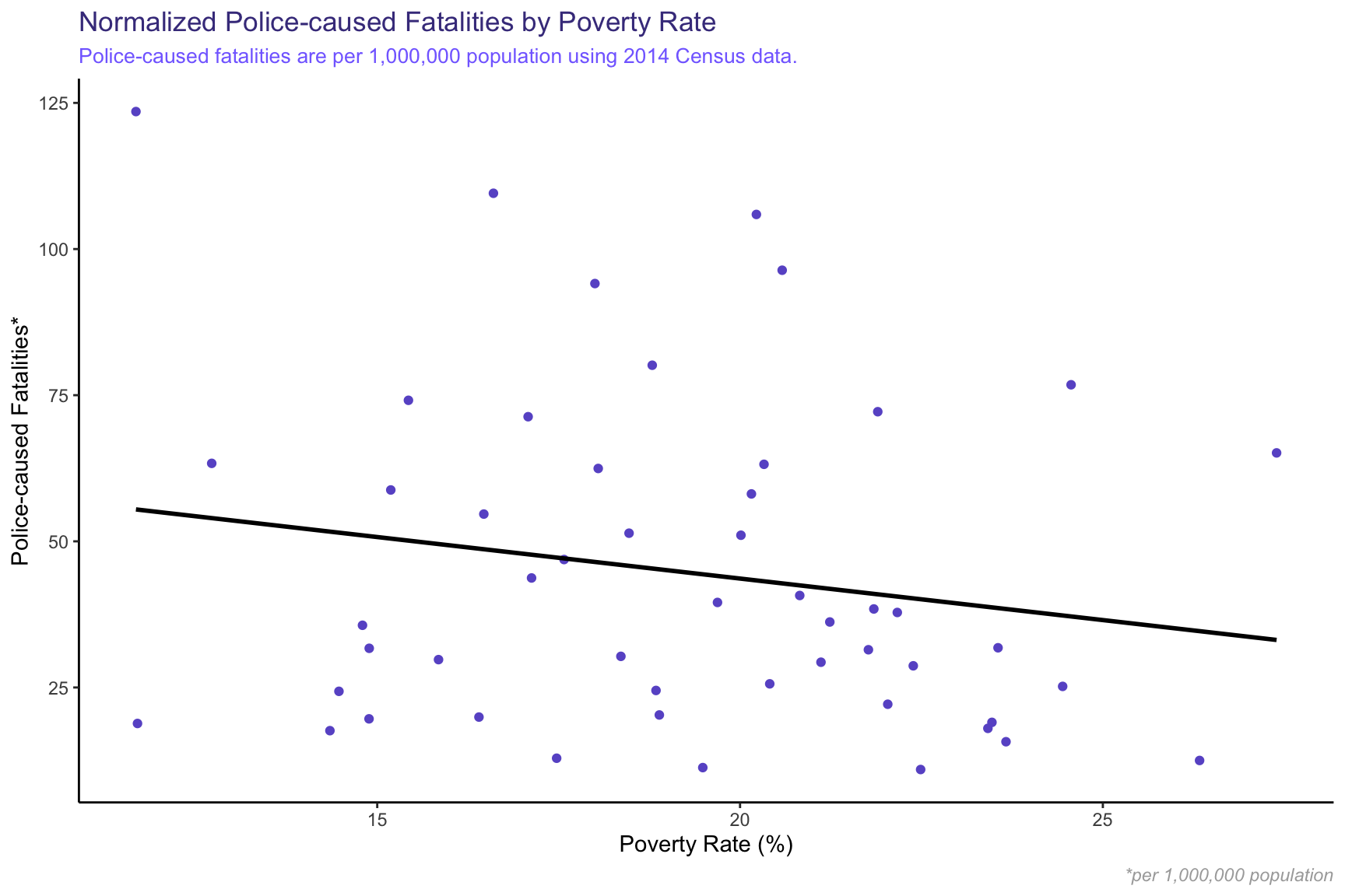
Again, while there is a slightly negative relationship, it doesn’t look to be a strong trend.
Mental Health Analysis
One thing that I often don’t hear covered in the media is the presence of mental health issues amongst victims of police-caused fatalities. Let’s take a look at what the data shows.
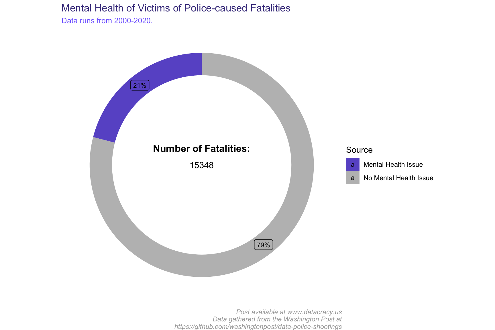
About 1 in 5 of the 15348 victims suffered from a mental health issue. Our data runs back to 2000 when, frankly, the conversation around mental health was not nearly as progressive as it is now. Thus, I would expect the proportion of victims who have mental health issues to decrease over time. Let’s check this out.
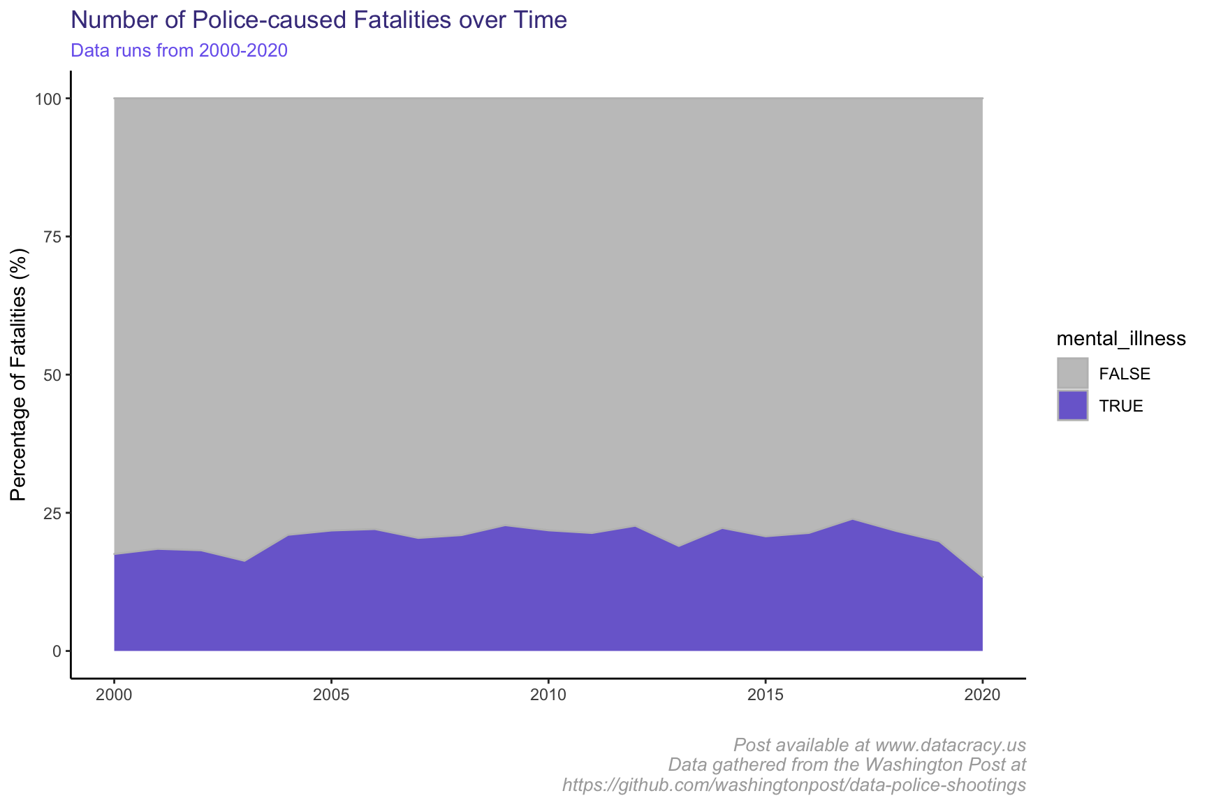
Let’s zoom in on the purple section of this graph.
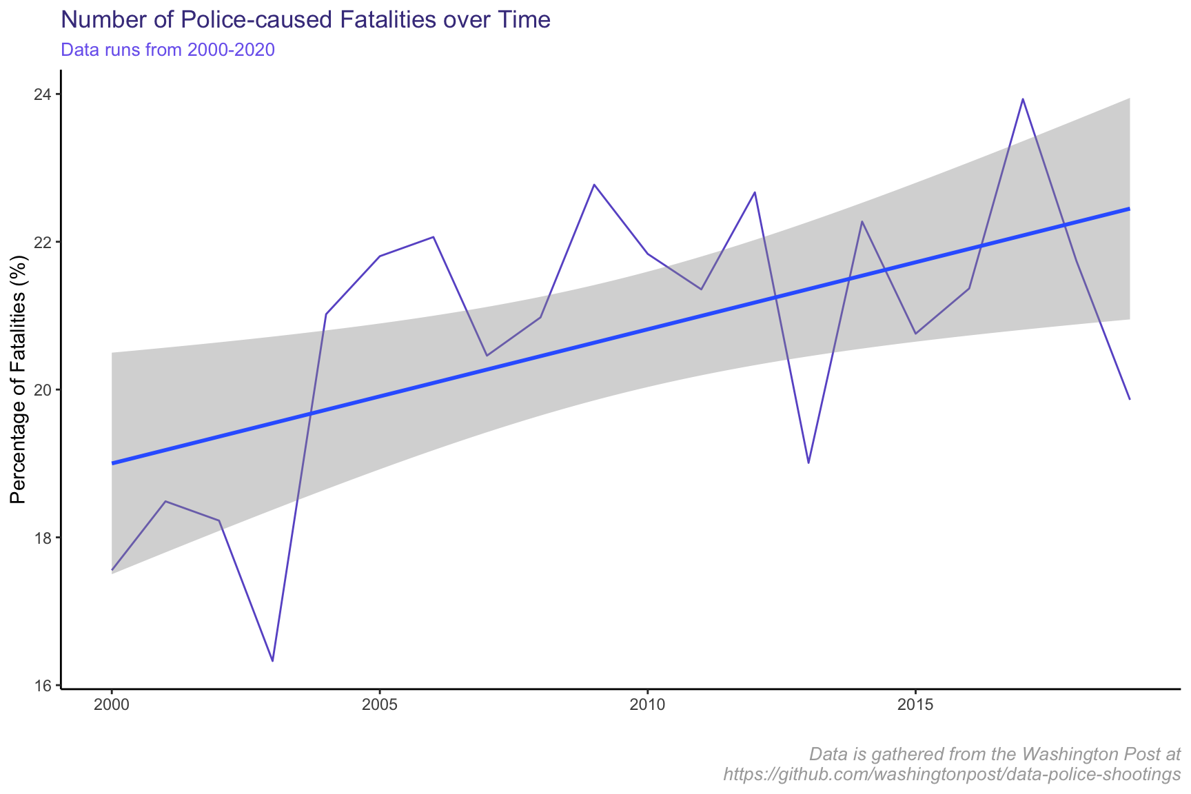
Interestingly enough, it seems that there is a slight upward trend in the percentage of victims of police-caused fatalities who were struggling with mental health at the time. However, starting in 2016, there seems to be a sharp decrease in police-caused killings of individuals with mental health issues. This seems to suggest that police officers started responding differently to those with mental health issues, likely due to the increased national discourse around mental health.
| Estimate | Std. Error | t value | Pr(>|t|) | |
|---|---|---|---|---|
| (Intercept) | 13.56 | 2.563 | 5.29 | 4.979e-05 |
| date | 0.0004969 | 0.0001758 | 2.827 | 0.01117 |
| Observations | Residual Std. Error | \(R^2\) | Adjusted \(R^2\) |
|---|---|---|---|
| 20 | 1.655 | 0.3075 | 0.269 |
Although it’s relatively small, we can see a strong trend between date and the proportion of victims who had mental health issues.
Conclusion
Thanks for reading! I hope you were able to learn a bit more about the data behind police-caused killings in the United States. If you felt like the article was educational, interesting, or if you just want to support me, feel free to follow me on any social media platform (all are listed as icons on the homepage) and stay tuned for the next post. If you have ideas on public policy/political topics that could use some data expertise, please send me your suggestions – the more ideas, the better!
Additional Resources
The original blog post can be found here:
https://jschulberg.medium.com/exploratory-data-analysis-of-u-s-police-caused-fatalities-fce47a2b7198
Interested in seeing my original code? Go to my GitHub repository here:
https://github.com/jschulberg/U.S.-Police-Fatalities
Interested in learning more on the subject? Go to:
https://mappingpoliceviolence.org/
Interested in seeing the Washington Post’s GitHub repository and source data? Go to:
https://github.com/washingtonpost/data-police-shootings
Notes on Data
Is the data trustworthy? For the most part, yes. The data is used in this analysis has been collected thanks to extensive work by the Washington Post. Despite their best efforts, there are a few potential issues with the data (and all data related to police-caused killings) that arise:
1. Data Collection | The post gathered this data by analyzing “local news reports, law enforcement websites and social media” and has tried to enhance the data quality by submitting requests to each individual police department. While their work has been extensive, the process is imperfect.
2. Government Tracking of Data | Although the FBI and CDC log fatal shootings by police, this data is well understood to be incomplete. The FBI is currently in a process of overhauling how they collect this data.
3. Data Under-reporting | It has been well documented the bias that exists in administrative record-keeping of police brutality. This would lead us to think that the data presented in my article under-reports the severity of the issue.